You do not need to rebuild the same report every Friday
Many businesses have one report someone rebuilds every week. The data comes from the same spreadsheet. The chart looks the same. The email goes to the same people.
The better version is simple: keep the spreadsheet, connect it to a dashboard, and let the owner check the numbers anytime.
What you'll build
A live dashboard that replaces one weekly spreadsheet report
Start with one report. In this guide, we'll use a Weekly Operations Report.
- Key numbers
- Charts
- Recent changes
- Overdue items
- Search and filters
- A simple live table
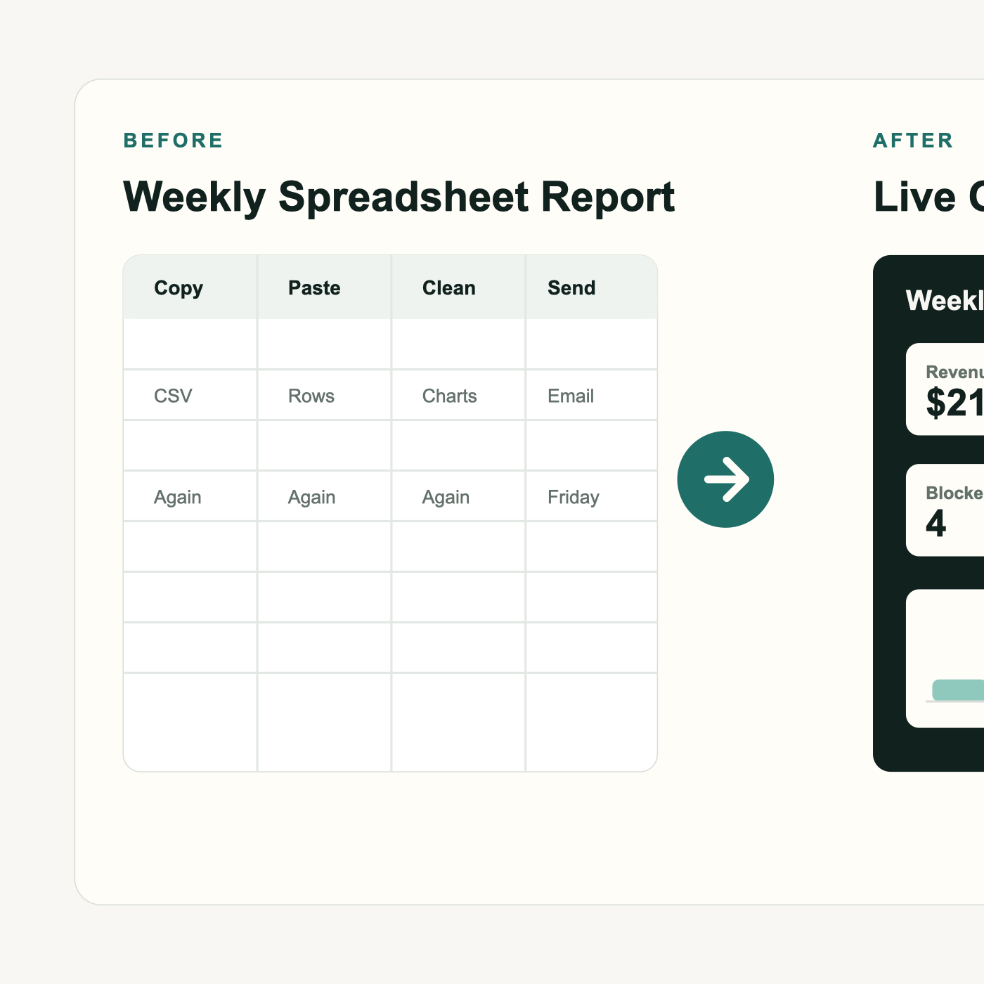
Before and after
The spreadsheet stores the data. The dashboard makes it easy to read.
Before
After
1. Pick one weekly report
Do not replace everything. Pick one report that is:
- Made every week
- Copied from a spreadsheet
- Used by the owner or manager
- Annoying to rebuild
- Important enough to check often
Good examples include weekly sales reports, open invoices, registrations, job status, employee tasks, customer follow-up, and inventory.
2. Choose the dashboard questions
Before touching the app, write down the questions the report answers. A dashboard should answer questions, not just show data.
| Question | Dashboard item |
|---|---|
| How much money came in this week? | Revenue card |
| How many invoices are unpaid? | KPI card |
| Which projects are late? | Table |
| Which customers need follow-up? | Filtered list |
| What tasks are blocked? | Status chart |
3. Clean up the spreadsheet
The spreadsheet should be simple and boring.
- One row per item
- One header row
- No merged cells
- No blank header names
- Dates in one format
- Money in one column
- Status values kept consistent
- No totals mixed into the data rows
Done
done
Completed
complete
FinishedTodo
In Progress
Blocked
DoneThe cleaner the sheet is, the better the dashboard will work.
4. Create a simple source sheet
Create a tab called Weekly Report Data. Keep one row per item.
| Date | Customer | Project | Owner | Status | Amount | Due Date | Notes |
|---|---|---|---|---|---|---|---|
| 2026-07-06 | ABC Construction | Sponsor Renewal | Jordan | In Progress | 12000 | 2026-07-18 | Waiting on logo |
| 2026-07-07 | Smith Dental | Recall List | Maya | Blocked | 3800 | 2026-07-12 | Needs final approval |
| 2026-07-08 | Desert HVAC | Invoice Cleanup | Carlos | At Risk | 6100 | 2026-07-15 | Sync issue |
5. Connect the sheet to the dashboard
Use the Google Sheets connection from the earlier tutorial. This dashboard reads rows from your report sheet.
React Query is a tool that helps the app ask for data, wait while it loads, and refresh it later.
Start by replacing only the report data. Leave the rest of the app alone.
6. Create the report data type
A data type is a simple list of fields. It tells the app what one report row should look like.
Suggested file: src/types/weeklyReport.ts
export interface WeeklyReportItem {
  id: string;
  date: string;
  customer: string;
  project: string;
  owner: string;
  status: "Todo" | "In Progress" | "Blocked" | "Done" | "At Risk";
  amount: number;
  dueDate: string;
  notes: string;
}
7. Map Google Sheets rows into dashboard data
The sheet gives us text rows. The dashboard needs clear fields. This small helper turns one row into one report item.
export function mapWeeklyReportRow(row) {
  return {
    id: `${row.Date}-${row.Customer}-${row.Project}`,
    date: row.Date,
    customer: row.Customer,
    project: row.Project,
    owner: row.Owner,
    status: row.Status,
    amount: Number(row.Amount || 0),
    dueDate: row["Due Date"],
    notes: row.Notes ?? "",
  };
}
8. Add the dashboard calculations
The spreadsheet gives us rows. The dashboard turns those rows into answers.
Suggested file: src/features/reports/weeklyReportMetrics.ts
export function getWeeklyRevenue(items) {
  return items.reduce((total, item) => total + item.amount, 0);
}

export function getOpenItemCount(items) {
  return items.filter((item) => item.status !== "Done").length;
}

export function getBlockedItemCount(items) {
  return items.filter((item) => item.status === "Blocked").length;
}

export function getAtRiskItemCount(items) {
  return items.filter((item) => item.status === "At Risk").length;
}

export function getItemsDueThisWeek(items) {
  return items.filter((item) => item.status !== "Done" && item.dueDate);
}
9. Add a React Query hook
This hook gives the report page a clean way to load the weekly report data.
export function useWeeklyReport() {
  return useQuery({
    queryKey: ["weekly-report"],
    queryFn: mockApi.getWeeklyReportItems,
  });
}
10. Build the live report page
Use the existing Reports page or create this file:
src/features/reports/WeeklyReportPage.tsx
export function WeeklyReportPage() {
  const { data = [], isLoading } = useWeeklyReport();

  if (isLoading) return <LoadingState />;

  return (
    <Page title="Weekly Operations Report">
      <MetricCard label="Revenue This Week" value={getWeeklyRevenue(data)} />
      <MetricCard label="Open Items" value={getOpenItemCount(data)} />
      <MetricCard label="Blocked Items" value={getBlockedItemCount(data)} />
      <MetricCard label="At Risk Projects" value={getAtRiskItemCount(data)} />
      <ChartCard title="Revenue by Day" data={getRevenueByDay(data)} />
      <ChartCard title="Items by Status" data={getItemsByStatus(data)} />
      <ReportTable items={data} />
    </Page>
  );
}
The live table should include:
- Customer
- Project
- Owner
- Status
- Amount
- Due Date
- Notes
- Search
- Status filter
- Loading and empty states
11. Make the dashboard feel better than the spreadsheet
The dashboard should add value. It should not just copy the spreadsheet into a prettier table.
- Colors for status
- Cards for key numbers
- Charts for trends
- Search
- Filters
- Late item warnings
- Mobile-friendly view
The spreadsheet stores the data. The dashboard makes the data easy to read.
12. Test it in one day
- Pick the weekly report.
- Clean the sheet.
- Create the source tab.
- Connect the sheet.
- Map rows into dashboard data.
- Show the first four cards.
- Add one chart.
- Add one table.
- Deploy to Render.
- Change a row in the sheet.
- Refresh the dashboard.
- Confirm the number changed.
13. Deploy to Render
- Push the project to GitHub.
- Open Render.
- Deploy the app.
- Add any Google Sheets environment variables.
- Open the live dashboard URL.
- Test with one spreadsheet change.
14. What to do next week
Do not overbuild on day one. Add the next useful thing.
- Add date range filters
- Email the dashboard link every Monday
- Add role-based access
- Connect invoices from QuickBooks
- Connect payments from Stripe
- Export a PDF snapshot
- Add comments or notes
- Add a needs attention section
Start by replacing one weekly report.
You do not need to stop using spreadsheets today.
Keep the sheet. Connect the dashboard.
Let the owner check the numbers anytime.
That is how a weekly spreadsheet becomes daily business visibility.
Done-for-you dashboard
Want help turning your weekly report into a live dashboard?
If your team already rebuilds the same report every week, I can help you map the workflow, clean up the source sheet, and build the dashboard around the way your business actually operates.
We can start with one report and one dashboard page. Then we'll decide what is worth automating next.
Get My Free Workflow Assessment